|
|
||
 |
||
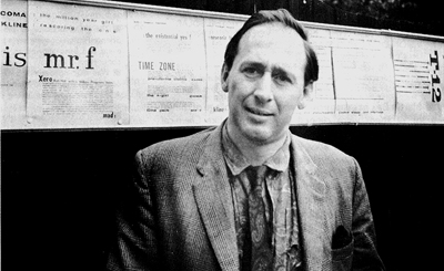 J.G. Ballard’s Graphic Experiments By Rick McGrath In the first fifteen years of his writing career J.G. Ballard created a small but influential portfolio of graphically experimental work, beginning in the late 1950s with his type collage, Project For A New Novel, and ending in the 1970s with a series of images called Advertiser's Announcements, which utilized the basic design parameters of print advertising. While it is interesting that Ballard the writer would even venture into the world of pictorial space, one shouldn't be too surprised, as Ballard has revealed that even when he started writing science fiction in 1956 he would have preferred even then to have written pieces similar to those in The Atrocity Exhibition. “I was interested in writing experimental fiction (though I hate the phrase, in fact) when I was still in school.” While Ballard doesn't elaborate that much on the form his early "experiments" took, except to tell David Pringle in 1982 that. "I was always interested in the visual arts. I bought a lot of art magazines, and I used to go to all the new exhibitions on in London." The direction he took was, perhaps not surprisingly, based on the design parameters inherent in magazines, billboards and print advertising -- the everyday of meda communications. Ballard’s earliest experimental work – Project For A New Novel – was highly influenced by the “This Is Tomorrow” Pop art exhibition at London’s Whitechapel Gallery in 1956. Although Ballard claims Pop art and artists had no influence on the commercial fiction he wrote in the late 1950s, the work he did on Project reveals he was strongly affected by that exhibition’s groundbreaking interest in collage and the meanings inherent in everyday or found objects. "It was a collage of things" Ballard told Pringle, "clipped from journals like Chemical Engineering News, the American Chemical Society's journal -- I used them a lot because I liked the typeface. I wanted to publish a novel that loked like that, you see -- hundreds of pages of thsat sort of thing. Get away from text altogether -- just headlines!"   It’s still unclear why so many elements of Project resurfaced years later in his breakthrough inner space short story, The Terminal Beach, and the experimental “condensed novel” classic, The Atrocity Exhibition. If Ballard actually knows – and he may not – he’s not telling. After all, this is a writer who is fascinated by the mediascape and who thrives on ambiguity and what he calls “open-ended” stories. “I wasn’t satisfied just by writing SF stories”, Ballard told Pringle. “My imagination was eager to expand in all directions.” And expand it did. In 1958 he created Project For A New Novel -- an entire novel reduced to magazine layouts, and planned to be posted on billboards. According to Ballard’s friend and Ambit editor, Dr. Martin Bax, “It’s eight frames photocopied with famous Ballard characters like Coma and Kline. Most of the text you can’t read because when you see things on billboards you don’t read the small print, so the text is deliberately blurred – you can only read the headlines and some remarks. I don’t know why I never published it… I had it framed some years ago. It hangs above my mantelpiece”. 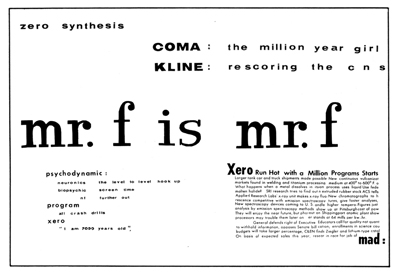 As Ballard himself describes the Project: "(These are) a series of four facing-page spreads that were specimen pages I put together in the late 50s... sample pages of a new kind of novel, entirely consisting of magazine-style headlines and layouts, with a deliberately meaningless text, the idea being that the imaginative content could be carried by the headlines and overall design, so making obsolete the need for a traditional text except for virtually decorative purposes... The pages from the Project For A New Novel were made at a time when I was working on a chemical society journal in London, and the lettering was taken from the US magazine Chemical and Engineering News -- I liked the stylish typography. I also like the scientific content, and used stories from Chem. Eng. News to provide the text of my novel. Curiously enough, far from being meaningless, the science news stories somehow become fictionalized by the headings around them." 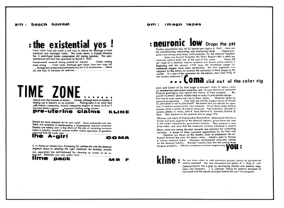 But more than that, the content of the Project must have struck a deep psychological chord with Ballard, as many of the characters and concerns in Project have resurfaced over the years, most notably in the 1964 short story, The Terminal Beach, and from 1965 to 1968 when Ballard wrote the first seven “chapters” of The Atrocity Exhibition. Ballard’s “collage of things” spawned such characters as Coma, Kline and Xero, and such phrases as “the terminal beach”, “Mr F is Mr F”, “thoracic drop” “intertime” “T-12” and many more Ballardian tropes now familiar to his readers today. 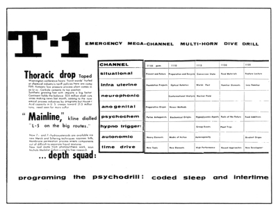 The set of four double-page spreads was finally printed in 1978 in New Worlds, 20 years after their creation. 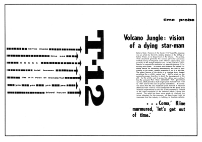 However, in July 2008, at the “J.G. Ballard: Autopsy of the New Millennium” exhibition at Barcelona’s Museum of Contemporary Culture, I made an incredible discovery. The exhibition organizers had obtained Dr Bax’s framed copy of Project For A New Novel, and precisely 50 years since it was created I discovered that it was not comprised of four double-page spreads, but five such spreads! 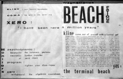 Such are the vagaries of memory. I wrote to Ballard about this new fifth element of Project, and he responded in a letter dated September 8, 2008: “As for the Project/New Novel, there were originally many more pages than seem to have survived -- in the late 50's/early 60s photocopying was an arcane business over here -- the draughtswoman at Chem & Industry who draws the formulae for the blockmakers had the key to the photocopying room, but I was able to charm her into letting me copy my experimental pages -- once I left C&I for good there was no means of photocopying, & over the years the originals gradually fell to pieces -- my home-made letraset cut from Chemical & Engineering News (& its companion Ind. Eng. Chem (Industrial & Engineering Chemistry) both American Chemical Soc. publications, glued together with everything from flour paste borrowed from the children -- those were the days!! We had genius but nothing else, a big mistake -- to rock hard furniture cement, began to crumble into alphabet soup -- I gave some pages away to people like Tom Disch + John Sladek, Judy Merril, Mike Moorcock, and then, sadly lost interest -- the ‘fictional’ elements were pure stream of consciousness, the first thing to come into my head. I clipped and scissored away.” Now, for many years the Project For A New Novel has been taken literally – that this novel that resembled pages on a billboard did represent some kind of story, but the viewer had to supply the plot. All Ballard gives us are three characters and a lot of scientific jargon about time, beaches, the parts of the backbone, and various psychological conditions. Plus Ballard's choice of form -- the magazine layout -- with its headine-driven design. The Project was all rather vague, but as it turns out, it was also rather incomplete. News of the discovery of the two new pages buzzed quickly through the ranks of the world’s Ballardians. Various new explanations were offered, but perhaps the best analysis of how this extra spread might work into the overall Project was suggested by David Pringle: “We are referring to it as a ‘fifth collage spread’, but in fact it's the first -- it's the hitherto-missing opening of the story, or 'story'. Considered as such, it does strengthen the narrative line, I think. Why? I like the way it opens by giving us, as clearly as anything can be in this mystifying, ultra-compressed "novel," the characters: there they are, right up front -- Kline, Coma and Xero -- and each briefly defined. I think we have the lineaments of a story in Ballard's 1958 Project for a New Novel, and the new discovery of this opening spread strengthens its story qualities -- at least to my mind.“ On the other hand, Ballard insists that he created Project as a “stream of consciousness”, rather than as an ultra-condensed novel, as Pringle suggests. In actuality, Project could be both. As Ballard told Graeme Revell in 1983: “This is where the open-ended character of my fiction requires the reader himself to make a significant contribution. I’m offering a kit with which the reader, using my books as a sort of instructional manual… [will] hear a loud whirring noise, which is the cosmos getting through to him.” Interesting and prescient as the Project For a New Novel is -- and no doubt the analysis of it will continue -- Ballard’s most famous piece of experimental work is the set of five “Advertisers Announcements” he did for Ambit magazine from 1967-1971. According to Ballard: “Back in the late 60s I produced a series of advertisements which I placed in various publications (Ambit, New Worlds, Ark and various continental alternative magazines), doing the art work myself and arranging for the blockmaking, and then delivering the block to the particular journal just as would a commercial advertiser. Of course I was advertising my own conceptual ideas, but I wanted to do so within the formal circumstances of classic commercial advertising – I wanted ads that would look in place in Vogue, Paris Match, Newsweek, etc. To maintain the integrity of the project I paid the commercial rate for the page, even in the case of Ambit, of which I was and still am Prose Editor. I would liked to have branched out into Vogue and Newsweek, but cost alone stopped me… “Claire Churchill (by the way, the subject of the first ad, was my then girlfriend, and still is) is also the subject of the fifth ad, which shows her, after swimming in the sea off Brighton, sitting naked in the front seat of my car covered with thousands of specks of seaweed – so outraged was she by my sneak photography that she stole my only copy of the ad, but she has agreed in the interests of Art and Literature to have it published. “The Angle Between Two Walls" is a still from Alone, the American filmmaker Steve Dwoskin’s movie about a masturbating woman. Neural Interval was a picture from a bondage magazine. I’ve no idea of the source for the strange gun photo, though Les Krims was a very well known US photographer.” Ballard’s five Advertiser’s Announcements are, of course, neither true advertisements nor examples of Pop or Surrealist art. They are a form of poster that seems to have appeared out of Ballard’s original idea to have The Atrocity Exhibition done as a book of collage illustrations. “I originally wanted a large-format book, printed by photo-offset, in which I would produce the artwork – a lot of collages, material taken from medial documents and medical photographs, crashing cars and all that sort of iconography.”[i] However, they are “ads” in the same sense that Project For A New Novel is a “novel”. Although not designed in the usual picture/head/text/logo layout used by the big ad agencies in the late 1960s (this was the era of the Rise & Dominance of the Creative Dept – think Volkswagen print ads) Ballard’s “announcements” reveal Ballard’s way of using art and text to define how (and in what order) you should read the piece. 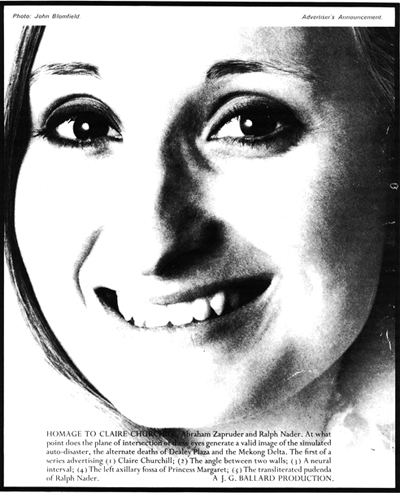 Homage to Claire Churchill is a love letter of art, a coded message written in Atrocity Exhibitionese, and a foreshadowing of future “announcements”. Ballard reduces all to a cropped closeup of Claire’s smiling face, and all that intrudes is a copy block (no headline) including Claire in Ballard’s holy trinity of Zapruder and Nader. This is a poster disguised as an advertisement that is really an homage. The emphasis on the face, with Claire’s large, sensual eyes, announces the non-sexual, romantic love – a conceptualization that Ballard will explore to other depths. 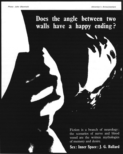 Does the angle between two walls have a happy ending? is another art-dominated piece, this time featuring the header, in full reverse, right above the transported face. Her abstracted hand reveals the source of her pleasure, and this act of imaginative creation is repeated in words as Ballard reveals the conceptual aspects of sex. Question headlines are usually avoided in real ads (nobody bothers to answer), but in this example Ballard takes our eye in a backward Z from the headline to the head to hand to text… skillfully designed, and actually an “ad”. One doubts very much that Vogue would consent to run it, though. The most explicitly “sexy” of the series, angle introduces the singularity of passion, emphasizing in onanistic terms the link between the two walls of reality and imagination and how they can meet in pleasure. 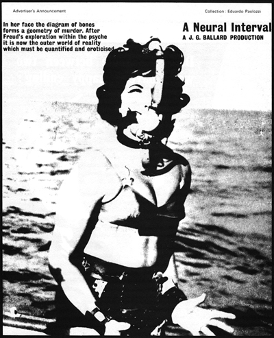 A Neural Interval is much the same is design and conception, this time the theme is the strangely non-sexual basis of fetishism. The bound lady in the boat appears pornographic, but is essentially clothed and non-flirtatious. If the “outer world of reality” is to be “quantified and eroticized”, then “this is where the conceptual systems behind certain kinds of deviant erotic or deviant sexual behaviour provide keys and devices.”[ii] The device is a symbol for sexuality, the key the imagination. Again, the layout is reversed – text before headline – but this still could work as an ad. 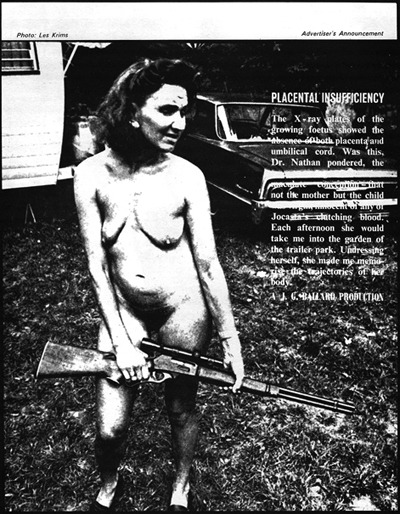 Placental Insufficiency is almost entirely picture-dominated as Ballard has chosen white type over a mottled background, making parts of it very difficult to read. Perhaps all we need to know is that a foetus is growing without any attachment to its mother. Pre-Alien concept. Dr Nathan from Atrocity Exhibition is named, but all this seems moot given the non-sexual nudity of the fantastic woman photographer Les Krims found in an American trailer (caravan) park. Locked and loaded, she appears slightly pregnant. Is the gun for the unborn precursor to the monsters in Low Flying Aircraft? Or for the photographer? There’s a level of madness present that makes this image uncomfortable to pursue. This ad works on the same level as the campaign designed by Richard Pearson in Kingdom Come. Sometimes madness is the only sane choice. 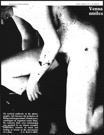 Venus Smiles is an ad about voyeurism. Suppressed by Claire Churchill for years after Ballard made it, she finally relented in 1971 and allowed her seaweed-strewn naked torso to be published. The copy appears to describe Ballard being conceptual by himself, stately with her. The photo does seem a bit of a braggadocio on Ballard’s part, and his decision to snap it unawares suggests an obsession with form studied at leisure. Again, Ballard’s design is symmetrical in this ad, with the head, art and text forming a forward slash across the page, which is further accentuated by Claire’s dominant white legs. Perhaps also a bookend to the first ad in the series – revealing Ballard’s progression through the psychopathologies of sex, from cerebral and conceptual -- the keys and devices – to the uncomplicated physical. What makes these pieces experimental is not Ballard’s use of sexual imagery -– all five simply feature close-ups of women in various states of dishabille -– but his use of Atrocity Exhibition text to twist the contextual aspect of the fictional effects of sex, how the mind affects the body. The copy obsessively harks back to neural intervals, outer reality, missing umbilical cords and surreal lists, all of which offer up the most tempting of explanations -– yours. And the history of you. In all of Ballard’s experimental work his technique is the same: reduce, reuse, recycle within the visual field. Fascinated with the causality of time, Ballard’s first step is to remove it. Bored with action/reaction, Ballard inverts it. Unwilling to accept the fictions of the world, Ballard creates a personal reality. The result is an autopsy report, or a box of tools, or a lineup of service station attendants at a police station. It’s up to you to make a kind of personal sense of it all. In many ways, it’s unfortunate and perhaps worth considering why Ballard did so little experimental work. Obviously, such output almost guarantees little or no commercial success, but artistically Ballard’s forays into his un- or subconscious thoughts have dredged up materials that had a strong and beneficial effect on his creative output during the 1960s. Why give that up? Ballard himself may have the answer: “Time goes by, one loses contact with one’s previous incarnations, one’s previous selves.” One could also argue, however, that Ballard’s central creative technique – ambiguity – also adds a tinge of the experimental to all his work, regardless of the specific creative form he chooses to adapt. |
||